- Windows 11 iconography uses application and system icons as a consistent visual language for actions, states, and concepts.
- The Segoe Fluent Icons font defines a minimalist, geometric, and scalable style that unifies the system's symbols.
- Windows icons have evolved from black and white drawings to complex vector sets aligned with Fluent Design.
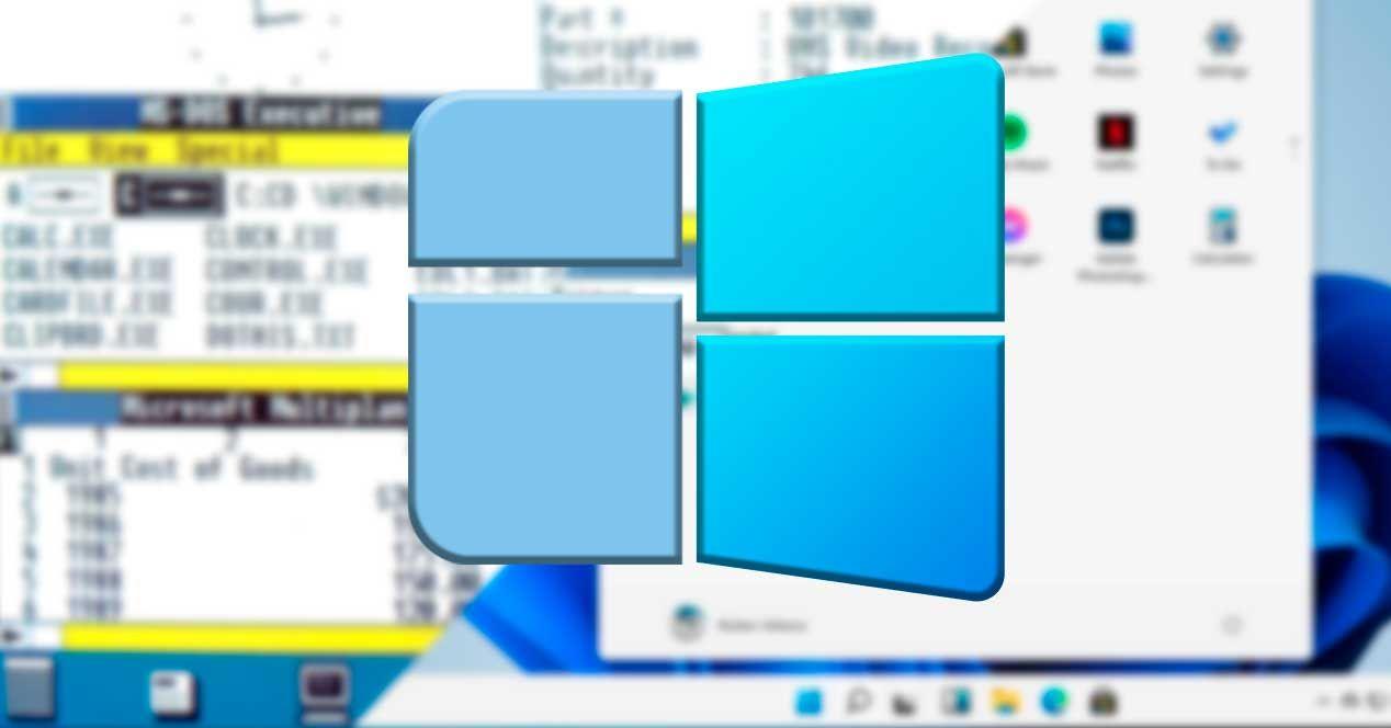
- Windows 11 debuts a revamped icon pack that abandons Live Tiles and reinforces visual clarity and consistency.
If you use Windows 11 daily, you've probably noticed that the system is full of small symbols everywhere: on the desktop, in the taskbar...in windows and even within applications. Icons are not there for decoration.but they act as a visual language so you can understand what's happening on your PC at a glance.
Although it may seem trivial, knowing the Meaning of Windows 11 icons It helps you navigate the system faster, avoid silly mistakes, and take advantage of features that often go unnoticed. Furthermore, behind each icon lies a whole process of design, history, and evolution that explains why we see Windows the way we do today.
What is iconography in Windows 11 and what is it used for?
When we talk about iconography in Windows 11, we are referring to the set of images, pictograms and visual symbols These elements appear throughout the operating system and its applications. They function as metaphors: they represent actions (a trash can icon to delete), states (a cloud with a checkmark to indicate successful synchronization), or concepts (a folder to indicate a file container).
Microsoft uses this iconography consistently throughout Windows 11 so that, once you understand the meaning of a symbol, you can recognize it instantly anywhere in the systemThis reduces the text on screen, speeds up navigation, and improves accessibility for all types of users.
Within this visual language, Windows 11 primarily distinguishes three major icon categoriesApplication icons, system icons, and file type icons. In everyday practice, application and system icons have the greatest impact on user experience, so we'll focus on those.
Application icons in Windows 11
The application icons are the ones that They identify each program installed on your computer.These are the ones you see on the desktop, in the Start menu, on the taskbar, and in the file explorer when you browse executable files or shortcuts.
Their main function is to serve as an access point to launch the application, but they also act as visible face of the app throughout the Windows ecosystemThey appear in program lists, notifications, dialog boxes, task switches, and much more. That's why Microsoft insists that each application icon should express the essence of what the program does.
The design recommendation is that these icons use a clear visual metaphor of the main function of the application. For example, a musical note for a music player, a pencil on a document for a text editor, or a stylized calculator for a spreadsheet app. The more direct the metaphor, the faster the user will associate it in their mind.
Microsoft provides specific guidelines for designers and developers to create icons consistent with Windows 11, taking into account aspects such as the overall shape, color palette, shadows, level of detail, and how the icon is displayed. It adapts to different sizes and resolutionsThe goal is for that same icon to be recognizable both in very small sizes and in large dimensions.
System icons and the Segoe Fluent Icons font
Beyond application icons, Windows 11 uses what are called system icons for internal interface elements: command bar buttons, navigation icons, status indicators, controls within context menus and many other parts of the user experience.
In Windows 11, these command prompts are based on a specific font called Segoe Fluent IconsInstead of being individual images, they are treated as glyphs of a typeface, which allows them to be easily scaled, maintain a uniform style, and ensure that they integrate well with the rest of the text and visual elements.
All the characters in this font are drawn in a style of single stroke and monolineThat is, as if they had been drawn in a single stroke with a line of constant thickness of 1 epx. This minimalist approach fits with the cleaner, more modern aesthetic that Windows 11 pursues.
The design of Segoe Fluent Icons follows three key aesthetic principles: minimal, harmonious, and evolved. “Minimal” means that each glyph includes only the essential details; “harmonious” means that it is based on simple and coherent geometric shapes; and "evolved" which opts for modern metaphors that any current user can interpret effortlessly.
Microsoft recommends that developers use these system icons within their own applications to achieve an interface consistent with Windows 11, both in style and behavior. For example, a search button or a share icon would be a similar icon. It looks the same in all appsand the user does not have to relearn meanings.
Icon size and metrics in Windows 11
An important detail in Windows 11 icon design is how sizes are handled. In the Segoe Fluent Icons font, each glyph is designed to maximize the usable area of the icon. fit inside a square em, which is the typical unit of measurement in digital typography.
This means that if you set the font size to 16 epx, the resulting icon behaves equivalently to a 16×16 epx image. This direct correlation makes the resizing and icon alignment in toolbars, menus, and other components, be much more predictable for both designers and programmers.
Thanks to this model, icons can scale clearly to different sizes without losing legibility or becoming visually distorted. It's a way to unify the way SVG or bitmap icons have been used with the logic of a vector font.
Icon modifiers: how to change the meaning
One of the iconography techniques in Windows 11 is the combination of base icons with modifier icons to create new visual meanings without having to design a completely new pictogram from scratch.
The base icons are the main element of the visual metaphor: for example, a monitor represents a display device, a cloud a cloud service, or a folder a file container. These base icons occupy most of the available areabecause they are the core of the message that is to be conveyed.
A modifier icon can be superimposed on this base icon, adjusting or refining its meaning. These modifiers are usually placed in one of the lower quadrants of the iconso that they are clearly visible but without obscuring the main element. Typical examples would be a small plus sign to indicate "new", a circular arrow for "synchronized", or a cross for "error".
This system allows for the consistent display of different states for the same object: for example, a normal user icon, the same icon with a small padlock to indicate a protected account, or with a cross for a disabled account. The user learns the basics and then only needs to interpret the modifier.
Using layers in Windows 11 icons
In addition to modifiers, Windows 11 uses icon layers to represent state variations. Overlaying two glyphs allows for the creation of different versions of the same symbol to indicate, for example, if something is active, selected, paused, or deactivated.
This layering technique is especially useful in rich interfaces, such as advanced toolbars or control panels, where it's desirable to indicate states without overloading them with text. With a simple layer change or by adding a small extra element, the icon communicates a different situation at the moment (for example, a bell with a line through it to indicate that notifications are muted).
The cultural significance and location of the icons
Although images are often said to be universal, Microsoft warns that iconography also has important cultural nuancesThe same symbol can be neutral in one country and seem strange or even offensive in another.
Therefore, it is recommended to validate icons considering the context of use and the target audience. In most cases, a traditional "translation" is not necessary, but it is advisable to consider whether certain hands, gestures, objects, or references are appropriate. understandable and acceptable in different culturesThis criterion affects both Windows 11 icons and those designed for applications that run within the system.
Principles for creating good app icons
Microsoft establishes a series of general principles to ensure that application icons in Windows provide a consistent and pleasant experience. The first is simplicity: it is advised design clean, clear and timeless iconsthat can be understood at a glance and do not depend on tiny details that get lost in small sizes.
The second pillar is to keep them universal. This means avoiding overly complex or abstract forms that only certain people can interpret. Following this line of thought, creation is encouraged. inclusive and easy-to-decipher icons in any cultural context, that they are based on common human motivations and not on overly local references.
The third principle could be summarized as "do less, but better." A well-made icon doesn't need hundreds of elements; every detail must be... thoughtfully designed to add valueThe idea is that the icon summarizes the application or function in a single visual piece, using simple shapes, transparency when touched, and a restrained use of decorative effects.
Where do application icons appear in Windows 11?
Application icons in Windows 11 are present in more places than you might initially think. They're not just on the desktop or taskbar: appear in the start menu, in the search engine, in the task switcher (Alt+Tab), in the notification area, and within many system dialog boxes.
They are also used in the Microsoft Store, in lists of installed programs, in default application settings, and in various settings sections. That's why Microsoft insists that the An icon is the first impression of an app.Often, a user decides whether or not to open a program based on what that small graphic conveys.
How to design and build Windows 11 icons
To create application icons that fit well in Windows 11, the official guides recommend working with a clear metaphor, carefully selecting the color palette, and paying attention to the interplay of light and shadow. The goal is for the icon to be, at the same time... functional, aesthetic and recognizable both in light and dark mode.
Another key point is that an application's icon set must scale correctly. It's suggested to prepare assets that look good in various sizes. different screen sizes and densitiesFrom the smallest views to the largest access points, ensuring that they do not become pixelated or lose their essence.
For apps that also run on Windows 10, there are additional considerations, such as compatibility with dynamic icons or "Live Tiles" that the system used to display updated information in the Start menu. Although these Live Tiles are less prominent in Windows 11, many of the legacy guidelines still apply. sharpness, contrast and visual simplicity.
Historical evolution of Windows icons up to Windows 11
To understand why Windows 11 icons are the way they are, it's helpful to take a quick look at their history. Modern computer icons have their roots in the 70s, when the research lab Xerox PARC began experimenting with graphical interfaces which replaced text commands with visual elements. Those pictograms resembled the drawings on cave walls: very simple symbols that represented objects and actions.
Over time, this idea reached commercial systems. Apple Macintosh and Microsoft Windows incorporated icons into their graphical interfaces to make computers easier for non-expert users to operate. In early versions of Windows, these icons served primarily to represent shortcuts to programs and unitsBut little by little they spread to files, folders, commands and practically every system process.
The format and technology of icons also evolved. Depending on the operating system, different types of image files or specific binary formats were used; in the case of Windows, the most characteristic has been the .ico extension. Over time, specialized tools appeared for generating and editing icons, and Windows expanded its capabilities. base icon packs included as standard.
Icons in the early versions: Windows 1.x and 2.x
In the initial versions of Windows 1.x (1985) and Windows 2.x (1987), the icons were very basic. They were only displayed when programs were minimized, either at the bottom of the screen or on the desktop. simple black and white drawings of 32 × 32 pixels, limited by the capabilities of the hardware of the time.
In those years, Windows ran as a sort of graphical layer on top of MS-DOS, and to launch applications, a manager called "MS-DOS Executive" was used, which didn't even display icons, only a list of file names. The visual experience was, compared to today, extremely rudimentary.
The arrival of color: Windows 3.0 and 3.1
With Windows 3.0 (1990) there was a major leap: the icons began to show 16 colors in the same size of 32 × 32 pixelsand acquired a somewhat three-dimensional appearance with simulated shadows. Designer Susan Kare, known for her previous work for the Macintosh, was key to this new style that blended fun and professionalism.
This version was the first to introduce color icons in Windows, creating visual archetypes that would influence many subsequent editions. Windows 3.1 (1992) retained the resolution and 16-color palette, but improved detail through dithering that simulated greater depth and more nuanced shadows. It was a refinement of what was already established rather than a revolution.
From Windows 95 to Windows 2000: more size and color
Windows 95 marked a turning point not only because of the overall interface, but also because of the icons. Many were redesigned, although quite a few were directly inherited from Windows 3.1. The standard icons remained the same. 32 × 32 pixels and 16 colorsHowever, the Win32 API already allowed working with icons up to 256 × 256 pixels and 16,7 million colors.
With the Microsoft Plus! add-on package, the use of richer color modes became popular, allowing up to 65.536 colors through a specific option or even manual adjustments in the system registry. Some icons, such as the one for the the floppy disk drive remained virtually intact from this time for decades, until being renovated very recently.
Windows 98 updated much of the icon set and introduced 256-color icons by default, maintaining the default size of 32 × 32 pixels but adding, for the first time, a larger option. 48 × 48 pixels ideal for higher resolution screensAgain, there was a mix of new icons with others inherited from Windows 95 and even Windows 3.1.
Windows 2000 and Windows Me continued this trend, maintaining the 256 colors and the 32x32 and 48x48 sizes. Several important icons, such as "My Computer," were modernized with added detail, though without any groundbreaking changes. Windows Me, in fact, reused many of the icons from Windows 2000.
XP, Vista and 7: the era of shine and transparency
With Windows XP (2001), icons took another big leap forward. For the first time, they were supported 32-bit icons with alpha channelThat is, with 16,7 million colors and true transparency, allowing for soft shadows and glass effects. Edges benefited from smoothing, avoiding the classic "jagged edges."
In terms of style, XP moved away from the legacy approach of Windows 3.0 and adopted icons with rounded corners, pronounced gradients, and a more three-dimensional look. Not all system icons were redesigned; many less frequently used ones remained reused from previous versions, but the overall feel of the desktop changed noticeably.
Windows Vista (2007) introduced the Aero visual theme, with transparencies and glossy effects that also marked the icons. For the first time, Windows shipped with an icon pack whose default size was 256 × 256 pixelsThe system scaled dynamically according to each user's preferences. The aesthetics were sophisticated and very much in line with the new interface.
Windows 7 (2009) reused almost entirely the Vista icon set, making minor adjustments to some elements such as the Control Panel and Paint icons. The redesigned icons began to soften excess shine and volumegradually moving towards a flatter, more frontal style.
Windows 8, 10 and the leap towards Fluent Design
With Windows 8 (2012), Microsoft attempted a radical change with its tile-based interface designed for touchscreens. "Live Tiles" were born—dynamic tiles that could display updated information—and in this context, many application icons became white silhouettes on solid color backgroundsIt was a drastic change from the volumetric icons of Vista and 7.
On the classic desktop, however, many traditional icons inherited from Windows 7 were still present, resulting in a somewhat mixed style. Windows 10 (2015) maintained this duality: on the one hand, it kept the Live Tiles; on the other, it continued to reuse numerous icons from previous versions with minor modifications and smoother gradients.
Starting in 2017, Microsoft began a long-term renewal process known as Fluent DesignThe aim was to resolve visual inconsistencies and give the entire system a more coherent identity. In 2020, new icons began to arrive for apps like Mail and Calendar, Calculator, Music, Movies & TV, and Alarms and Clock, featuring greater depth, color, and a sense of movement.
Windows 11: New icon pack and goodbye to Live Tiles
Windows 11 arrives as a turning point in this journey. The system bids farewell to "live tiles" and definitively moves away from the Metro concept of Windows 8, opting for an environment more consistent with centered taskbar, rounded corners, and a revamped Start menuIn that context, the icons are also almost completely redesigned.
Microsoft has prepared a virtually new icon pack for system folders, disk drives, desktop items, and core applications. These icons work better with dark mode, abandoning the overly simplistic style and adopting a more modern look. soft gradients, vibrant colors and the new style that defines the Segoe family and Fluent Design.
Folders, the control panel, file explorer, and specific buttons have received a facelift, contributing to a more modern and cohesive feel throughout the Windows 11 environment. The general consensus among those who have tried the preview versions is that the icons are more attractive and consistent which in Windows 10, helping the system feel like a truly new generation.
The mystery of some user icons in shared environments
On computers where multiple people log in, it is common to find user icons with small variations in its silhouette or in its indicatorsFor example, different head and shoulder silhouettes may appear, with more generic or more stylized shapes, or with distinctive features that are not always obvious.
In many cases, these differences do not depend on the specific user, but on internal system states, account types, or configuration changes (local accounts, Microsoft accounts, domain-connected accounts, temporary profiles, etc.). This explains why a user might display one type of silhouette one day and a different one the next, after an update or status change.
Behind these variations there is usually nothing critical; they are simply visual representations of how the system classifies or identifies that profile at a given time. Even so, these kinds of details often spark curiosity because they don't always exist. Clear documentation for each little icon that appears in Windows.
Keeping in mind that these user icons reflect statuses, settings, or account types helps avoid getting obsessed with small graphical differences that, in practice, do not affect the security or daily operation of the computer.
Taken together, all this evolution and all these design decisions mean that, when using Windows 11, we are interacting with a visual language carefully constructed over more than three decades. Understanding the Meaning of Windows 11 iconsIts origin and internal rules allow you to move through the system more easily, make better use of its functions, and appreciate the work behind each small symbol we see on the screen.
Table of Contents
- What is iconography in Windows 11 and what is it used for?
- Application icons in Windows 11
- System icons and the Segoe Fluent Icons font
- Icon size and metrics in Windows 11
- Icon modifiers: how to change the meaning
- Using layers in Windows 11 icons
- The cultural significance and location of the icons
- Principles for creating good app icons
- Where do application icons appear in Windows 11?
- How to design and build Windows 11 icons
- Historical evolution of Windows icons up to Windows 11
- Icons in the early versions: Windows 1.x and 2.x
- The arrival of color: Windows 3.0 and 3.1
- From Windows 95 to Windows 2000: more size and color
- XP, Vista and 7: the era of shine and transparency
- Windows 8, 10 and the leap towards Fluent Design
- Windows 11: New icon pack and goodbye to Live Tiles
- The mystery of some user icons in shared environments