- Choosing the chart type based on the objective (trends, comparisons, breakdowns) is key to avoiding confusing visualizations in Excel.
- Pie charts, radar charts, bubble charts, and advanced formats, when misused, can distort interpretation if categories or visual effects are overused.
- Advanced charts (waterfall, funnel, bullet points, tornado, speedometer) only add value when they clarify the message and are supported by reliable and well-formatted data.
- Good practices such as avoiding 3D, limiting axes and series, and designing with empathy towards the audience improve the readability and usefulness of any chart in Excel.
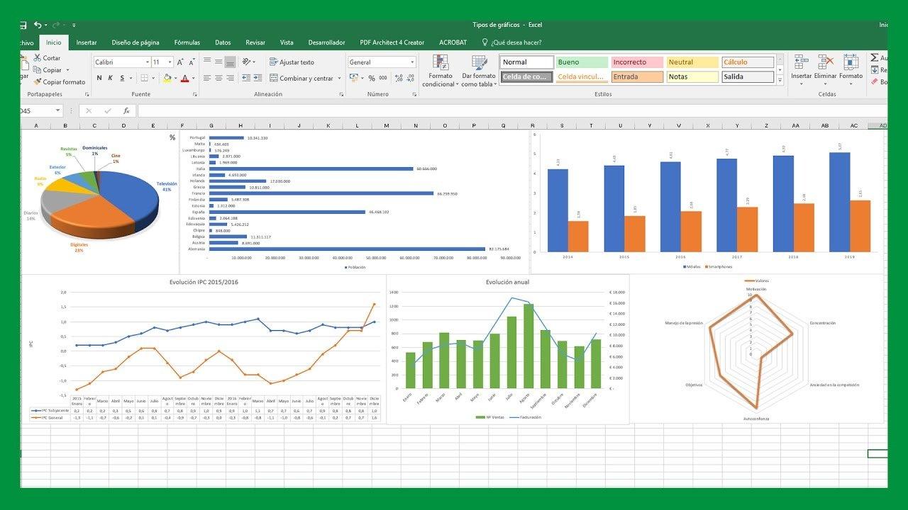
If you work with spreadsheets daily, you know that a well-chosen chart can transform an endless table into a clear and easy-to-understand story. But it's also true that a poorly designed chart in Excel can do more harm than good: errors in data selection, inappropriate visualization types, unnecessary 3D effects, or confusing axes that distort the message.
In this article we'll see, step by step, which charts to avoid or use with extreme caution in Excel , how to choose clearer alternatives, and what best practices will help make your reports more readable, professional, and useful for decision-making, whether you're doing simple analyses or advanced financial dashboards.
Common mistakes when creating charts in Excel and how to avoid them
Before getting into specific types of charts, it's worth reviewing some very common problems when trying to graph data in Excel , which can give you error messages, inconsistent results, or charts that are impossible to understand.
One of the most common errors occurs when working with CSV files or other text formats . Although they may appear visually correct, Excel doesn't always interpret all values as numbers . Sometimes cells retain text formatting, hidden spaces, or different decimal separators, and when attempting to create the chart, a warning appears stating that the formula or selected range is invalid.
If you have a matrix with two columns and hundreds of rows, and Excel still won't let you create a chart, it's very likely that part of the range contains data that mixes text and numbers, or incorrectly formatted empty cells . In these cases, it's advisable to check the actual cell formatting, use tools like "Text to Columns," or consult a guide on Excel databases to ensure everything is correctly typed as numeric.
Another common problem arises when selecting data for the X and Y axes in a scatter chart. Sometimes, when trying to manually specify the series from the dialog box, Excel returns the message that the entered formula is incorrect , even when you are simply dragging the mouse across the range. This is usually due to inconsistent ranges (columns of different lengths), mixed references between sheets, or argument separators that do not match the system settings (semicolon vs. comma).
Furthermore, when working with a file saved as .csv or converted to .txt, differences between Excel versions (Windows vs. Mac, for example) can have an impact . It's relatively common for the chart to display perfectly on one platform while showing errors or interpreting columns differently on another, especially due to the decimal separator and field delimiter. In these cases, it often helps to save the file directly as an Excel workbook (.xlsx), check the regional settings, and rebuild the chart from scratch with the normalized data.
Choose the right type of chart according to your goal
Beyond the technical issues, one of the keys to avoiding "breaking" your analyses is choosing the right chart type for your report's purpose. Excel offers a wide variety of options: bar, column, line, area, pie, scatter, bubble, radar, funnel, waterfall, etc. But not all of them work equally well for every use case.
The first thing you should ask yourself is what you want to explain with your data : a trend over time? a comparison between categories? how a total value is broken down into parts? a distribution? the evolution of an indicator against a target? When you have this idea clear, it is much easier to discard those graphs that only add visual noise or distort the interpretation.
For example, if you need to show a month-by-month trend, a line chart is usually much clearer than a pie chart , as it allows you to follow the time sequence and identify peaks, valleys, or inflection points. On the other hand, if your goal is to compare the contribution of several categories to a total, a bar chart or a stacked area chart might be a better fit, provided it's used carefully.
It's also important to consider the number of categories or series you'll be representing. The same type of chart might be perfectly readable with five categories but become completely unwieldy with twenty. At that point, it's sometimes preferable to change the chart type, group smaller categories into "other," or even divide the information into several simpler visualizations.
When to use bar charts and when they can be a problem
Bar charts (and column charts) are probably the most widely used tool for comparing quantities between groups . They work very well when you want to see, at a glance, which category has more or less value, or how a few variables are distributed in relation to others.
Their main advantage is that visually comparing lengths is very intuitive . The human eye easily detects which bar is taller (or longer), provided they are well-spaced and ordered. This is why they are so useful in sales reports by product, results by department, budget comparisons between areas, and so on.
However, these charts become a headache when the number of categories is excessive or too many series are combined at once . A grouped column chart with ten products and four years of comparison can turn into an unreadable jumble of colors, where the main message is completely lost.
To avoid this, it's essential to limit the number of bars visible in a single visualization, maintain uniform spacing between columns , and use a simple and consistent color palette. When the list of categories is very long, it's best to group them, filter by the most relevant ones, or use a pivot table in Excel to summarize the information before displaying it.
Another mistake to avoid is the use of 3D effects in bar charts . While they may seem eye-catching, they distort the perception of heights and make it extremely difficult to compare values. Furthermore, they add unnecessary visual noise that contributes absolutely nothing to the analysis.
Line charts: ideal for trends, dangerous if there are too many series
When you want to track the evolution of one or more indicators over time, a line chart is the classic and almost always the most recommended option . It allows you to plot the trajectory of each data series continuously and quickly locate key moments: peaks in demand, sharp drops, seasonality, etc.
Its main strength is its simplicity: an X-axis representing time (days, months, years) and a Y-axis representing the indicator's value . This is enough for the reader to understand, almost effortlessly, how the variable behaves. Furthermore, you can overlay two or three lines to compare, for example, actual sales versus target, or different customer segments.
The problem arises when you try to fit too many series into the same chart. If you include eight or ten lines, the colors start to repeat, the legends become illegible , and the chart ends up looking like a spiderweb where it's impossible to follow each trend. In such cases, it's better to separate the analysis into several charts or highlight only the truly relevant series.
It's also important to control the use of secondary axes. Excel allows you to add a second Y-axis to represent indicators on different scales , but overusing them can confuse the reader and give the false impression that completely different series are related simply because they share the same visual space.
A good trick to avoid overloading the graph is to accompany it with lines labeling specific data points at the most relevant peaks or valleys , instead of labeling every single point. This reinforces the interpretation without cluttering the visualization with numbers everywhere.
Area charts: useful for cumulative magnitudes, dangerous due to overlaps
Area charts are similar to line charts, but the space under the line is filled with color . This makes them particularly useful when you want to highlight cumulative volumes or the relative contribution of different components over time.
For example, they can work very well to represent how different product lines contribute to total monthly sales , or how time is distributed among different activities over a period. The "filler" effect conveys a sense of volume and weight that can be very useful in certain narratives.
However, its main weakness is that when several areas overlap, the underlying series become difficult to interpret . Even when playing with transparency, it's easy for some layers to become practically hidden, or for the reader to be unable to clearly distinguish where each area begins and ends.
Therefore, if you decide to use area charts, it's advisable to limit the number of series and choose colors with well-considered contrasts . When the priority is to accurately compare individual values, it may be preferable to choose a conventional line chart or a stacked chart with fewer dimensions.
In short, area charts are a powerful tool for telling stories of cumulative magnitudes, but they are not the best option when a very precise reading of each value is required or when many variables are being handled simultaneously.
Pie and donut charts: when to avoid them (almost always)
Pie charts and donut charts are among the most well-known to the general public, but they are also, by far, some of the charts best avoided in Excel except in very specific cases . Their purpose is to show how a total is distributed among several parts, but the way they do so doesn't always promote clarity.
The main problem is that comparing angles and sector areas isn't as intuitive as comparing lengths . When the differences between segments are small or the number of categories is high, it's almost impossible to accurately determine which contributes more or less to the total. Adding labels with tiny percentages around the circle completely ruins the readability.
Therefore, a good rule of thumb is to avoid using pie charts with more than five segments . Beyond that point, the representation becomes unclear and turns into an aesthetic exercise with little analytical value. If you have many categories, it's better to group the smaller ones under "other" or simply use an organized bar chart or another more precise format.
Doughnut charts share these same problems and even exacerbate them by adding a central gap that reduces the visual surface area of each segment and further complicates comparison . While they may look "nice" in a presentation, they are rarely the most suitable option for serious analysis.
In short, if your goal is for the reader to quickly understand how a total is distributed, a bar chart ordered from highest to lowest is usually much clearer than a pie chart . Reserve pie charts for very simple cases, with very few categories and very marked differences between them.
Scatter plots and how to show key points on the curve
Scatter plots are the ideal tool when you want to analyze the relationship between two numerical variables , representing one on the X-axis and the other on the Y-axis. They are especially useful for visualizing correlations, data distributions, scatter plots, and patterns that are not visible in tables.
Often, when working with experimental data or activity peaks, it's useful to highlight the maximum value of a curve or a specific point . In Excel, this can be done by selecting the scatter plot series and adding data labels only to the point you want to emphasize, or by creating a second series containing only that value and formatting it differently (different color, larger size, different marker).
One mistake to avoid with scatter plots is carelessly mixing data that isn't properly formatted as numbers . If any of the axes contain text values or invalid cells, the chart may fail or display misplaced points. Thoroughly reviewing the data range is critical here, especially when it comes from CSV files or external imports.
Another important aspect is choosing the right axis range. Excel tends to automatically adjust the scales, but in some cases this can create an exaggerated sense of variation or, conversely, flatten the differences too much. Manually adjusting the minimum and maximum limits can help make the representation more faithful to the story you want to tell.
Finally, if you're working with a lot of data points, it's a good idea to minimize elements like grid lines, borders, and embellishments . In a dense scatter plot, the important thing is that the points are clearly distinguishable and that, if there's a trend, it can be identified at a glance, even adding a trend line when it makes sense.
Less common advanced graphics: when they shine and when they become a mess
In addition to classic charts, Excel includes more unusual chart types that, when used effectively, can provide a very interesting perspective to your analysis. However, they are also fertile ground for aesthetic abuse and confusion if applied indiscriminately.
These advanced formats include radar (or spider) charts, waterfall charts, funnel charts, bubble charts, milestone charts, custom actual vs. target charts, bullet charts, stepped charts, tornado charts, and the ever-popular speedometers. They all have their purpose, but it's crucial to understand when they provide real value and when it's best to avoid them.
A general principle for these charts is to always prioritize readability and accessibility over visual impact . A dashboard full of exotic charts might look very "modern," but if the audience doesn't understand them at first glance, the visualization's purpose is lost.
We're going to review each of these formats, looking at their most appropriate uses and the risks of using them carelessly, so you know which ones can help you tell your story better and which ones should only be used in very specific contexts.
Radar or spider chart: for very specific multivariate comparisons
The radar chart, also known as a spider chart, represents several variables on radial axes that originate from a common center . Each category is placed on an axis, and the values are joined together forming a kind of spider web that allows for a global comparison of the profile of each series.
This type of chart is especially useful for comparing the strengths and weaknesses of different elements : products against quality criteria, employee skills against a standard, survey results across various dimensions, and so on. At a glance, you can see which axes each series excels on and where it falls short.
The problem is that when too many series or categories are added, the web becomes a jumble of overlapping lines and polygons that is very difficult to read. Furthermore, the human eye is not very good at estimating radial distances and polygonal areas, so accurately comparing values can be challenging.
Therefore, it's best to use radar charts with a limited number of categories and few series , and only when the goal is to show a general "profile" rather than an exact numerical reading. If you need absolute precision, a table or a segmented bar chart will likely work much better.
In presentations, these graphs can have a significant visual impact, but it is important to clearly explain to the audience what each axis represents and how to interpret the areas , to avoid misinterpretations or hasty conclusions.
Waterfall chart: very useful in finance, dangerous if categories are overused
The waterfall chart is used to show how an initial value is affected by a series of increases and decreases until a final result is reached . It is very common in financial settings: revenue breakdowns, margin analysis, net profit trends, budget variances, etc.
Its strength lies in breaking down a total into clearly visible positive and negative blocks , making it easy to understand where gains and losses occur. Each intermediate column represents a factor, and the whole paints a clear picture of the path from the starting point to the finish line.
The risk arises when too many intermediate elements are included or heterogeneous concepts are mixed . A waterfall chart with twenty different columns can be as overwhelming as an endless table, and it loses the pedagogical effect that makes it so powerful.
Labeling and scaling also need to be carefully considered. If categories and values are not clearly presented, the reader may misinterpret the contributions of increases and decreases , or fail to clearly understand the relative weight of each. In management contexts, where decisions are made quickly, this can be particularly critical.
Used sparingly, the waterfall chart is one of Excel's most valuable advanced formats, but it should be reserved for analyses where the sequential breakdown is truly relevant and not just as decoration.
Funnel chart: good for processes, bad if it's used for everything
The funnel chart is used to represent sequential processes in which the volume decreases stage by stage . It is very common in marketing and sales: website visits, leads, opportunities, proposals, closed sales, etc.
Visually, it displays a series of horizontal blocks that progressively narrow to reflect the drop in volume throughout the process. This helps to quickly identify where the most opportunities are being lost, where bottlenecks are concentrated, and which phases deserve more attention.
The common mistake is trying to use funnel charts for any kind of hierarchical or descending information , even if it doesn't actually represent a sequential process. When their use is forced outside of conversion contexts or clear flows, the interpretation becomes confusing and the chart loses its meaning.
Furthermore, if the differences between stages are very small, the visual effect of the funnel is greatly reduced , and perhaps a sorted bar chart or a simple table with conversion rates is a clearer and more honest alternative with the data.
In short, use the funnel chart when you really want to visualize a process with quantifiable inputs and outputs , and avoid using it just because it looks "nice" on the dashboard.
Bubble chart: powerful for three variables, problematic if the effect is overused
The bubble chart is a natural extension of the scatter plot, where each point is represented as a bubble whose size depends on a third variable . Thus, in the same 2D space, you are showing three dimensions: position in X, position in Y, and magnitude through the area of the bubble.
This type of visualization is very useful when you need to analyze complex relationships between three factors : for example, price, perceived quality and sales of different products; or revenue, costs and profit by region; or any similar combination in market research or performance analysis, or even transferring them to Power BI when you require interactive capabilities.
Its Achilles' heel is that comparing bubble areas isn't as intuitive as comparing heights or lengths . The human eye tends to underestimate or overestimate size differences, and if the scales aren't well chosen, some bubbles can appear much larger than they actually are.
It's also important to avoid overloading the chart with too many bubbles. If you fill the space with dozens of points, the bubbles will overlap and the overall image will become difficult to read . In such cases, it's advisable to filter, group, or segment the data before displaying it, so the reader can draw conclusions without getting lost in a sea of circles.
Use bubble charts when all three axes of information are truly relevant to your analysis, and clearly explain to the audience what the size of each bubble represents , so that no one draws the wrong conclusions.
Other advanced graphics: milestones, actual vs. target, vignettes, staggered, tornadoes, and speedometers
In addition to the types more visibly incorporated into the interface, Excel allows you to build advanced custom charts using combinations of series and formats , which are especially valuable in the financial and management fields.
Milestone charts, for example, highlight key dates along a timeline , helping to place data in its historical context and communicate to non-financial audiences where the project stands and what has been achieved so far.
Actual vs. target charts (expectation vs. reality) are combinations of columns, lines, or other elements that compare achieved performance with the established goal . Although there is no single template for creating them, they are essential for visually conveying whether or not you are on track with your objectives.
Bullet charts are compact and highly effective: in a small space, they display the actual value, the target, and a qualitative background (e.g., good, average, poor). This is why they are so widely used in dashboards, as they concentrate a lot of information without overwhelming the report with countless scattered figures.
Stepped or stepped charts, in turn, allow for a better visualization of abrupt jumps in performance , showing horizontal segments and discrete changes instead of smooth lines. This clarifies where the changes actually occur and helps interpret historical data to project future scenarios more accurately.
Tornado charts are constructed from comparative bars arranged from highest to lowest , typically to analyze sensitivity or compare a metric from two sources (for example, sales of different products in two stores). Stacked in descending order, they form a kind of tornado that allows you to see at a glance where the greatest differences are concentrated.
Finally, speedometer-style charts, inspired by car dashboards, display an indicator on an arc divided into zones (red, yellow, green) . They are very popular in financial dashboards for monitoring KPIs, as they quickly convey whether a value is within an acceptable range or not, although they should be used with caution to avoid visually exaggerating minor changes.
The same principle applies to all these advanced graphics: if they don't clarify the message, it's best not to use them . The goal isn't to fill the report with visual "gadgets," but to better communicate the information critical for decision-making.
General best practices when working with charts in Excel
Regardless of the type of chart you choose, there are a number of guidelines that will help make your visualizations cleaner, more understandable, and more professional , avoiding errors that are constantly seen in presentations and reports.
First, ensure that the source data is reliable, complete, and up-to-date . No chart, however impressive it may seem, will compensate for incorrect, outdated, or poorly consolidated data. If the database is flawed, the chart will be misleading at best and dangerous at worst.
Secondly, always choose the type of chart that best represents the message , not the most visually appealing one. Prioritize quick readability and intuitive understanding over aesthetic impact. Furthermore, try to minimize the number of secondary axes and duplicate scales, as these often lead to confusion and misinterpretation.
Third, pay attention to the basic design: use a simple and consistent color palette, eliminate unnecessary grid lines , and avoid gratuitous 3D effects and shading. Every visual element that doesn't provide useful information is a distraction that hinders interpretation.
Finally, practice empathy with your audience. Ask yourself exactly what the person reading the report needs to see , what their context is, how much time they will dedicate to it, and what decision they need to make based on that data. Adapting the level of detail, the type of chart, and the way you present it to that audience will make the difference between a forgettable report and a real management tool.
Ultimately, the key to avoiding mistakes with Excel charts isn't knowing all the exotic types that exist, but knowing when to avoid confusing ones, when to opt for simpler alternatives , and how to apply a few good design and data quality practices that will ensure your visualizations tell the right story, without unnecessary embellishments and with maximum clarity.
